Showing posts with label shading. Show all posts

Thursday, November 14, 2013

Art Lesson: Sketch Page of Puppy.


This week, I am sharing a page from my sketch book
showing how to draw this sitting puppy.


Here is the page from my sketch book.


Here is a page you may print up for your children or yourself,
if you would like to try sketching the pup.
(It is free for use, just not for resale).


Thanks for stopping by!


(To copy these pages, click on the image, right click, and then click on "copy".

Open up Microsoft Word and right click on the screen, and then click "paste".
 The image should paste onto the page.

You can then click "print".
If you have difficulties or suggestions, please let me know.)


Wednesday, October 2, 2013

Art Lesson: How to Enhance a Monochromatic Stencil


My daughter's flooring in her bedroom was in desperate need of repainting.

I recently painted it a color called Henrietta in Annie Sloan's Chalk Paint.
This paint is an excellent choice when one does not want to go through the tedium of sanding.

I will go into the actual process of the floor being painted this weekend.

For now, I will just share how I enhanced some of the butterflies we painted all over her floor.


 First, I used the internet to get some ideas for butterfly styles and flying positions.

I found some great images from The Graphics Fairy.

From these ideas, I created some simple drawn images on cardstock paper.

I then cut these out to use as stencils
(My preschooler added her scribbles to my stencil).


I stenciled these all over the floor in different sized groupings.
My daughter wanted butterflies that were purple, pink, and red.

She has very definite opinions about what she likes and it usually looks pretty nice,
so I went with this.

After the stenciled butterflies had dried,
I went back and added some details to some of them.

She didn't want them all detailed,
so I left some as they were.


Here are the steps I used to enhance them.


 (You may print this above image of the steps for your personal use,
if you'd like).


 Here are a few others in different colors.


It really does look nice now that we have them all on the floor.


I can't wait to show you the whole thing done,
but I need to finish painting a few more things in the room,
so I hope to get at least one of them done before I take the "finished" pictures this weekend.


Thank you for stopping by.

I will be posting lots of different artsy things this month each day,
so check back again soon!


God bless!

To see the finished floor, click >HERE<.
To print up the butterfly stencils for your own use, click >HERE<.

Sharing at these fun blog parties:
Funkyjunkinteriors.net
Sixsistersstuff.com
Dearlittleredhouse.blogspot.com
Themodestmomblog.com
Theprairiehomestead.com
Btweennapsontheporch.net
 Thegraphicsfairy.com


Wednesday, September 18, 2013

Watercolor: the Rose


Hello!

Last week we started adding watercolor paints to the jar and leaves of this sketch.

This week, let's paint the rose.


I started with a very watered down red over the whole flower.

I let it dry.


I then started on the outside with some dark edging.
Sometimes I start flowers from the center.
I think whatever one feels comfortable with starting is the key.


I continued adding the edging: a watered down wider edge
as well as a darker more distinct thinner line where I saw it in the photo.


This process continued in toward the middle.


At a certain point, I find I have to add the center so I can make sure that all the details are being put in the right places.


Once the whole rose was painted in, it looked a bit dark and flat to me.
The great thing about watercolors is that some of the color can be pulled up using a wet paper towel.


I was then able to repaint the detail with a little less color.
It should be noted that this should be done carefully and with limited attempts because the paper can begin to disintegrate with too much rubbing up.


I am sure there are many ways to paint a rose:
if only there was a way to paint the incredible scent of it, as well,
but, of course, that is what makes the real thing so wonderful.


Next week, we will finish this piece by going over the steps used to shadow the jar and rose.


Thank you for stopping by.
Be sure to pick up a brush and add some color to the canvases in your own life.


To see the beginning of this painting click:
Art Lesson: Watercolors Painting a Blue Canning Jar
To see the conclusion of this painting click:
Art Lesson: Shadows with Watercolor


Sharing at these blog parties:
Funkyjunkinteriors.net
Shabbynest.blogspot.com
 Sixsistersstuff.com


Tuesday, September 10, 2013

Art Lesson: Watercolors - Painting a Blue Canning Jar.


Hello!

This week I will be sharing,

dare I admit this,

one of the my few attempts with watercolors.


Please know that I am certainly not trying to come across as proficiently skilled with these fun paints called watercolors.


Yes, I know: how can I teach an art lesson on something I am not well experienced at?
Well, let's just say that I am on this learning journey, too,
and am sharing my trials and errors hoping they will help somebody else out.

Of course, I have created countless "watercolors" using the kid sets of brightly colored chips of pigment that my children seem to turn to mud within a five minute painting session.

Although children watercolors are inferior to the beauty of good watercolors,
I think the general feel/techniques of them helps to prepare for the better quality ones.

So, if you are inexperienced with them, just put on your childhood smock and bring up that happy memory of painting with those muddy palettes.


I watched several Youtube videos to get some ideas, tips, and general procedures before I decided to open up the new set of Winsor and Newton set of 14 watercolors I recently picked up on a good sale.

I put a plastic placemat under the watercolor paper on which I had lightly transferred the image from my original sketch.  I then taped the paper and the placemat down around most of the edges using masking tape.  I found the paper wanted to buckle too much when it wasn't securely taped down as one of the artists had mentioned on Youtube.


I watered down the white and put a wash of this over the top half of my painting.


I then created a light brown with the red and green and watered it down very much so it was a wash under the canning jar and rose.


One thing I saw on one of the videos was how paper towels can be a good friend when it comes to water coloring


Once I had the wash over the page, I began to play with the colors on the back of the lid of the paint set.


 I started with a watered down green, knowing the leaves in the distance and the stems in the jar would not need to be detailed so this would allow a slight margin of error for my lack of experience.


I then mixed up a watered down blue/green trying to achieve the color of the glass jar
and began applying it wherever I felt most comfortable starting.


I created a very watered down gray and used it on some of the lettering where it appeared to be in the photo.


After I had worked on the blue for a while,
I decided to stop and add the very light yellowish/peach color of the light reflections on the glass.
I mixed yellow and a bit of red and white.

I am not sure what created this color on the glass.
Could the rose have influenced this? 


 Whatever the reason, I wasn't going to argue with the photo and just tried to paint what I felt I saw.


The stems of the roses in the canning jar were resting behind the "B" of the Ball written on the glass,
so this altered the colors in it.


 As I worked, I continued to add streaks and color wherever I saw I had neglected it.

I worked as I felt comfortable and that it was an enjoyable progress.  I quit work when it felt like it was becoming frustrating.

I stopped at around this point.


I will share the work on the rose and completion of this painting next week.


Have you worked with watercolors?  
I found them very rewarding and can see I will want to pick it up and try another painting soon.


To see the next step of this painting click on:
Art Lesson: Watercolor Rose
Art Lesson: Shadows with Watercolor


Wednesday, August 14, 2013

Art Lesson: Painting the Hand that Holds the Golden Duckling.


Hello, again!

This week, I decided it was time to finish my duckling picture
which I am painting on a recycled kitchen cabinet door
(I have had a couple of people give them to me when they came across used wooden ones that were unwanted).


I will be honest and admit that finishing this painting meant fixing that hand,
and painting hands is not something that I find to be easy.

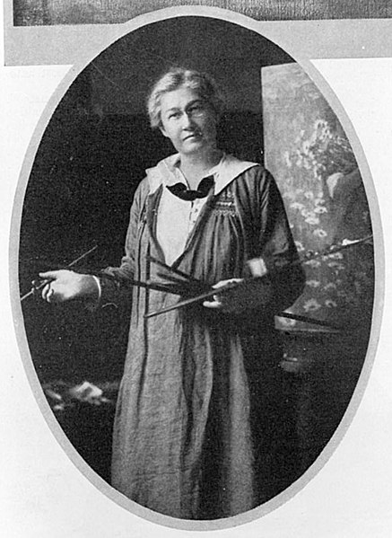
I wish I had a bit more Jesse Wilcox Smith in me.


Jesse Wilcox Smith was an American illustrator born in Philadelphia in 1863.
Unlike many who pick up the pencil in childhood and sketch throughout youth, Jesse discovered in her early twenties that she enjoyed drawing and after studying under another great American illustrator, Howard Pyle, went on to illustrate for numerous magazines including over 200 covers for Good Housekeeping magazine.

Jesse was shy and lived with three (and then two when one left to be married), other young women artist.  They had a 50' by 50' studio built over the top of a barn and lived in the nearby carriage house.
Despite the fact that she never married or had children, she is well-known for her images of mothers with children and was recruited by many to illustrate their children.

She used a variety of techniques: charcoal, oils, watercolors, varnishes.
  

You will likely recognize her work:
This is the image from A Child's Garden of Verses by Robert Louis Stevenson.


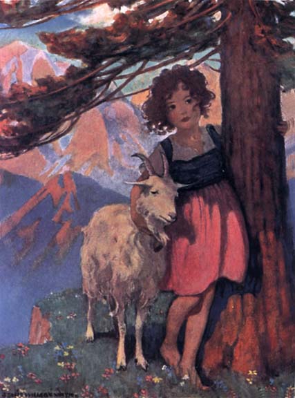
and this is the image she created for the book Heidi by Johanna Spyri.

(There are hundreds of other wonderful illustrations you can see by looking up Jesse Wilcox Smith.)


One thing Jesse is known for is her great ability to draw "hands."

I am not so skillful in the subject.

Skin is a colorful thing.

We may think of it as being generic in it's coloring,
but really, most skin colors have many colors in them.


I received this art catalog this week in the mail,
where I buy my copic markers and prismacolor pencils.
I noticed the painted woman's face on the front cover:
 look at all the colors in it.


 The catalog is in my hand right now, and it is actually more of a bluish tint, that greenish color around the nose, but there is green in there, too, yellow, pinks, browns, tans, whites, red, grays...
what color isn't in skin?


The way that light falls on skin can determine the colors in it.
Whether the hand is holding something can alter the coloring as well.

Notice the shading here?
The light is hitting the painted hand holding the duckling from the above left.
The light is hitting my hand directly straight down onto the side we see.

Can you see the difference in the coloring because of the shading?


To get warmed up with the paints, I decided to improve a few things in the duckling that I saw were wrong: the size of his eye, the coloring around his eye, and some of the softness in the shading of the feathers.


 Once I had finished up and felt more prepared to paint the hand, I looked at it and tried to decipher the colors in it
(minus the marker and paint stains on the actual picture of my daughter's hand).


When I looked at the hand, I decided to start at the lightest sections and work down from there.


I put a fresh layer of paint on
and then worked down into the reddish-orange shaded area...


 adding shading into the pointer finger as well.


I think part of the mark of being an artist is wearing some of the paint, don't you think?

My finger's always end up getting their fair share,
as using my finger to dab and mix in colors to blend seems to be a habit.


 Of course, constantly looking back and forth to the picture and identifying features that need more shading or distinctive colors made me fall into working on the two fingers from the other hand,
and I just kept working on areas that looked like they weren't quite right yet.


The painted fingernail got a bit of shading.

I used just a touch of blue along the lower edge of the hand and blended it well with the black.
It seemed to soften the dark edge with a bit of blue in it.


 I finished up by adding some crease lines along the lower finger and a few barely visible light lines of creasing where the wrist meets the arm.


 I set the picture down and walked away for a few minutes.

I find it always helps to set it down when I think I am done and come back with fresh eyes.
I can pick out areas that need touching up
like lightening the lower line of the hand in places to make it look more gentle
and fixing duckling tail feathers that weren't quite long enough.


At this point, I decide that I am done.
The hand is not perfect but I am happy with it as it is far better than other hands I have done,
and I feel like if I play with the paints any more, I may ruin the contentment I have for it right now.


 I finished a bit later with a slight background of the duck house wall.


It will brighten this wall in the bathroom until we take our things in to the fair in a couple of weeks.


What about you?  Have you ever painted a hand
or had fun noticing the hues of the skin?

Take a chance to notice this week and challenge your artful endeavors.

Thanks again for stopping by!