Showing posts with label glass. Show all posts

Wednesday, September 18, 2013

Watercolor: the Rose


Hello!

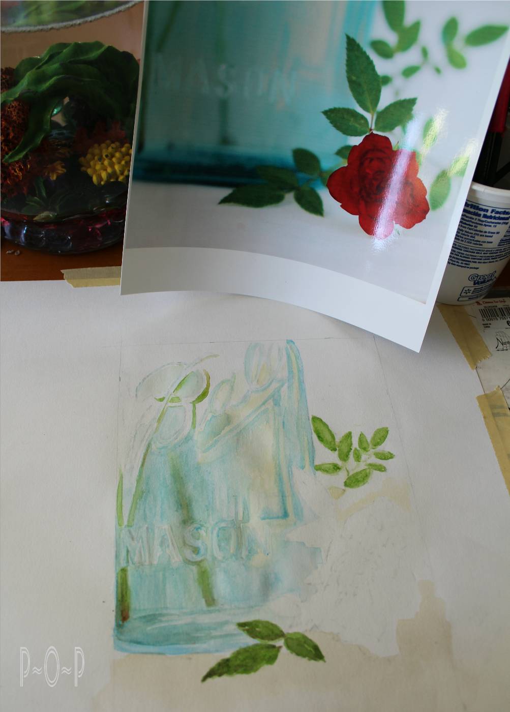
Last week we started adding watercolor paints to the jar and leaves of this sketch.

This week, let's paint the rose.


I started with a very watered down red over the whole flower.

I let it dry.


I then started on the outside with some dark edging.
Sometimes I start flowers from the center.
I think whatever one feels comfortable with starting is the key.


I continued adding the edging: a watered down wider edge
as well as a darker more distinct thinner line where I saw it in the photo.


This process continued in toward the middle.


At a certain point, I find I have to add the center so I can make sure that all the details are being put in the right places.


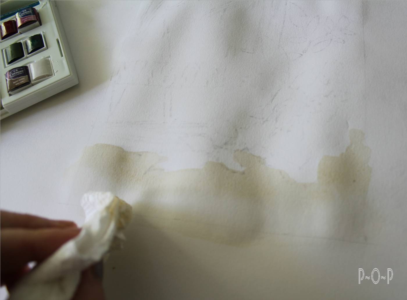
Once the whole rose was painted in, it looked a bit dark and flat to me.
The great thing about watercolors is that some of the color can be pulled up using a wet paper towel.


I was then able to repaint the detail with a little less color.
It should be noted that this should be done carefully and with limited attempts because the paper can begin to disintegrate with too much rubbing up.


I am sure there are many ways to paint a rose:
if only there was a way to paint the incredible scent of it, as well,
but, of course, that is what makes the real thing so wonderful.


Next week, we will finish this piece by going over the steps used to shadow the jar and rose.


Thank you for stopping by.
Be sure to pick up a brush and add some color to the canvases in your own life.


To see the beginning of this painting click:
Art Lesson: Watercolors Painting a Blue Canning Jar
To see the conclusion of this painting click:
Art Lesson: Shadows with Watercolor


Sharing at these blog parties:
Funkyjunkinteriors.net
Shabbynest.blogspot.com
 Sixsistersstuff.com


Tuesday, September 10, 2013

Art Lesson: Watercolors - Painting a Blue Canning Jar.


Hello!

This week I will be sharing,

dare I admit this,

one of the my few attempts with watercolors.


Please know that I am certainly not trying to come across as proficiently skilled with these fun paints called watercolors.


Yes, I know: how can I teach an art lesson on something I am not well experienced at?
Well, let's just say that I am on this learning journey, too,
and am sharing my trials and errors hoping they will help somebody else out.

Of course, I have created countless "watercolors" using the kid sets of brightly colored chips of pigment that my children seem to turn to mud within a five minute painting session.

Although children watercolors are inferior to the beauty of good watercolors,
I think the general feel/techniques of them helps to prepare for the better quality ones.

So, if you are inexperienced with them, just put on your childhood smock and bring up that happy memory of painting with those muddy palettes.


I watched several Youtube videos to get some ideas, tips, and general procedures before I decided to open up the new set of Winsor and Newton set of 14 watercolors I recently picked up on a good sale.

I put a plastic placemat under the watercolor paper on which I had lightly transferred the image from my original sketch.  I then taped the paper and the placemat down around most of the edges using masking tape.  I found the paper wanted to buckle too much when it wasn't securely taped down as one of the artists had mentioned on Youtube.


I watered down the white and put a wash of this over the top half of my painting.


I then created a light brown with the red and green and watered it down very much so it was a wash under the canning jar and rose.


One thing I saw on one of the videos was how paper towels can be a good friend when it comes to water coloring


Once I had the wash over the page, I began to play with the colors on the back of the lid of the paint set.


 I started with a watered down green, knowing the leaves in the distance and the stems in the jar would not need to be detailed so this would allow a slight margin of error for my lack of experience.


I then mixed up a watered down blue/green trying to achieve the color of the glass jar
and began applying it wherever I felt most comfortable starting.


I created a very watered down gray and used it on some of the lettering where it appeared to be in the photo.


After I had worked on the blue for a while,
I decided to stop and add the very light yellowish/peach color of the light reflections on the glass.
I mixed yellow and a bit of red and white.

I am not sure what created this color on the glass.
Could the rose have influenced this? 


 Whatever the reason, I wasn't going to argue with the photo and just tried to paint what I felt I saw.


The stems of the roses in the canning jar were resting behind the "B" of the Ball written on the glass,
so this altered the colors in it.


 As I worked, I continued to add streaks and color wherever I saw I had neglected it.

I worked as I felt comfortable and that it was an enjoyable progress.  I quit work when it felt like it was becoming frustrating.

I stopped at around this point.


I will share the work on the rose and completion of this painting next week.


Have you worked with watercolors?  
I found them very rewarding and can see I will want to pick it up and try another painting soon.


To see the next step of this painting click on:
Art Lesson: Watercolor Rose
Art Lesson: Shadows with Watercolor


Wednesday, August 28, 2013

Art Lesson: Writing Neatly on Artwork.


Hello.


Today I am going to be picking up my pencil
and giving a tip on how I go about creating wording in artwork.


I took some pictures of two enjoyable elements in my life:
canning jars and flowers.   I thought this would be a fun picture to attempt for a fair exhibit.

I want to experiment with some watercolor paints since it has been quite a while since I have used them, so I thought the blue glass would be bright and bold.


I decided to narrow the focus of the picture, but I always seem to have trouble with wording.
Writing neatly, especially on artwork seems to be a frustration for me.

I start the sketch on tracing paper to work out the details.
I knew I would be making many mistakes and a lot of erasing.


One trick that really helps me is to get the shape/position of the lettering drawn in first,
usually in the shape of a rectangle.


I then sketch in the first letter, and usually the middle letter and last.
This isn't always the exact middle letter.  It depends on the size of the letters.  "I's"  take up much less space than "M's" or "W's".

Because of the angle of the jar in this picture, I started with the first letter and the last letter that looked full-sized.


I then worked and reworked the lettering until I got the letters to look as they did in the photo.


The borders of the rectangle help me to keep to the letter size, spacing, and angle I need them to go.

Have you tried doing lettering on artwork?
Do you have any tips to share?  I'd love to hear.

I will work some more on this picture and show you how it turns out soon.

Thanks for stopping by and take some time to enjoy the roses...
it's always worth it!