Sunday, April 28, 2013

Repurposed Old Window Painted Stained Glass.


We have an enclosed back porch, and there is a window that looks out from the office onto it.
I have wanted to find a large stained glass piece to put in it, but the price of something this size was well over $300.
I decided to create one using paints and an old six paned window I picked up for a few dollars at an antique store.


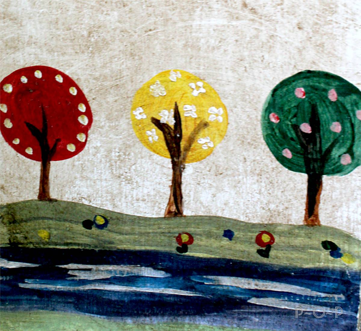
A few weeks ago I shared a small painted stained glass piece I did using Martha Stewart gloss glass/craft paints.
That was my trial piece for the large window piece that I wanted to create.


After cleaning the window off and washing with alcohol, I divided each pane into the sections I wanted to create, using cut up 4" by 6" cards.  I used a dish to mark where I wanted the middle design to be.
I traced these one with a dry erase marker (a transparency marker would work as well).


Once I got the images the way I wanted, I used the black gloss opaque paint to outline the images.  I piped this right onto the glass right from the container using the fine tipped lid (trying to be consistent in the flow of paint). 

(I later realized for a stained glass look, mixing silver with black into an empty container and mixing them well gives a more realistic "lead" look, but this simple black look is also very pretty).


This should be allowed to dry thoroughly for a few days.  Otherwise, when adding the other colors, if brushed against too much with a paint brush, the black may start to loosen and shift.


 Once the black is dried, the colors may be added in.

I found that opaque paints may be used but should be mixed by about half and half with liquid fill,
and then painted in with a brush.

I used opaque paints for the red, yellow, pink, orange, blue, purple.

 Colored liquid fill may also be used, but since I already had some of the colors in opaques, I decided to use them and just add some transparent liquid fill to water them down.
These should be mixed by about half and half with liquid fill,
and then painted in with a brush.


To create a more realistic "stained glass" look, I found the following method worked best.
 Using two different color greens and a clear, I mixed them together on my palette.


I then painted them into the space that I wanted green.
(Using two different color greens gives the green more variance.)


 Once I had the whole section painted with a thin coat of the green, I added just a touch of the opaque white and swirled it slightly in.


I then added a little bit to the painted green, mixing it around til I got the look I wanted.
(For the white section next to the greens, I did the same technique, only I used a base coat of white opaque mixed with the liquid fill and added small swirls of green).


When the spaces are filled, you may find, as I did that there will be places that the outline was not consistently piped on.


This can be remedied by going back and piping the black onto those places where the colored paint is leaking onto the black. 
(This can be done while the colored paint is still wet, or after it is dried.  If you feel confident, correct while still wet.  If you are worried about slipping, wait until it is dried.).


 After the paint has dried (and please, don't be hasty; the paint is very runny when it is wet!), holding the piece up to a window will reveal places that were not adequately painted.  These can be filled in with paint and allowed to dry to make the piece look complete.


(Be careful about putting too many layers of paint onto the glass.  I recommend painting it once or twice with two thin coats allowed to dry thoroughly in between coats
and then adding touch up color to spots as needed.  Too many layers of paint will make it lose the "glass" look by making it too thick and lumpy.)


My "stained glass" piece fills the window the way I was hoping and cost about $30 to make.

I used 14 bottles of paint, some of which I purchased in a set with a coupon and the extras while they were on sale for 40% off.  The extra paint left-over has created numerous other projects as well.
These are the colors I used:
  • red
  •  yellow
  •  pink
  •  orange
  •  2 blues (one opaque, one liquid fill)
  •  white
  •  3 greens (2 liquid fills, 1 opaque)
  •  purple
  •  clear liquid fill
  •  and black with silver painted on top.


Happy crafting!


Thursday, April 25, 2013

Vintage Ducks Illustrations.


Last weekend, we picked up four Muscovy ducks for our farm.
I had two pet geese when I was a teenager which instilled a special place for waterfowl in my heart.

Hopefully, we'll be able to keep them from predators and enjoy their useful consumption of flies and ticks
as well as watching them float around on the pond.

(Is it just me, or do you find it very restful to watch ducks swimming on the still water of a pond as well?)


I thought these old book illustrations were fun to share this week.
Here is some cleaned up versions.


This one also caught my eye.


My ten year old has especially been enjoying the new members on our farm.

(Some cleaned up versions follow:)


I have envied her, peacefully sitting on the soft spring grass, the ducks and drake nibbling the grain from her hands.
I have to admit, I have given in a couple times and joined her.

Sweet little ducks.


Feel free to use these vintage illustrations for fun projects.
They are from the late 1800's so there shouldn't be any copyright on them.


Linking up at:

Wednesday, April 24, 2013

Colored Pencil Bear: Drawing from Book Images.


(Here is the sketch I will use to teach today, as well as the colored pencils that were used).


Hello, and welcome back to another lesson in art.


A good exercise in art is to draw different animals.
There is so much variety in animals, and it is always a fun undertaking.
Of course, animals are not ones to sit still and pose, and it isn't always easy to wrangle up a polar bear for a session from which to paint.
This is where books and magazines come in handy.


My son received this Animal Encycolpedia as a Christmas gift from his grandmother.
I immediately knew that I would be borrowing it from him.
It is the nicest book I have ever seen of animals, such a huge variety and they are all real pictures, not drawn ones.
(Of course, I do appreciate drawn pictures, I just like to draw from real ones.)


I picked up this book the other week and decided to sketch a bear.


I started with the lightest color I could distinguish in the bear's fur, and sketched the outline of his head.
It isn't necessary to erase all the lines since the color will blend in with the colors that are added.


Next I measured with my pencil where the eyes were on the head
and lightly drew in some lines to place them.


From there, I lightly marked in the bears features:
nose, mouth, ears.


I darkened some of those features that I felt confident were in the right places...


 and then added in some colors for shading around the eyes, his mouth, and the edge of his head.


At this point, I sat back and looked at the original bear picture, and my own,
and really critiqued how things were going and what needed to be fixed.
(I try to do this along the way, of course, but at this point, I could sees something was off).

 Can you see what it was?

Look at the bear's head from his eyes to the top of his head.
My bear's head is not tall enough over his eyes and between his ears.

Thankfully, this can be fixed by extending the head and ears with the original lightest color,
and then working to blend them in.


Next I went a bit heavier with the reddish brown,


and then darkened around the eyes, nose, and in the fur with a brown/black.


As the shading continued, I found it helpful to edge in the dark fur at the top of his head.


 Legs were darkened it.  This helps me see where the boundaries of his head are.


When I had my bear to the point where I felt finished, I went back with some of the lighter colors
and blended the fur in at certain places, to get rid of any underlying white.


He was a fun sketch to work on.


 Do you have any books with real animal pictures in them?
If you do, try sketching one soon.  Take your time, be patient, and draw what you see.
There were several times in this sketch that things looked terribly wrong to me and I wanted to quit,
but patience was worth it for me this time.
No, my bear isn't perfect, but I like the way he turned out, and he was good practice.

Remember, practice makes perfect.


 Until next time, thanks for stopping in!

Sunday, April 21, 2013

Old Canister Turned Toilet Paper Cover


Sometimes it is fun to let go of realism and paint something colorful and imaginative.


~*~*~*~*~

Old canisters such as these can be found in many second-hand stores and yard sales.


It seems a shame to just let them gather dust on the shelves when they can be given new life
and used to house an assortment of things we own: legos, checkers, cards, pencils, markers, crayons, stamps, tape, glue sticks,
or even toilet paper.
(Just be sure to try which of the canisters fits best over the toilet paper as well as on the back of the toilet).

To paint wooden surfaces like these, a light sanding is required to remove the shiny coat of varnish.
This will allow the paint to stick better.


My husband cut a few small wooden pieces and screwed through them on the underside of the bottom of the canister
so that the knob would have a better fit and be a more secure.  Having little children in the house, I was afraid that gluing the knob would not be strong enough.


 Using acrylic paints, I chose some fun colorful trees, a barn,
some flowers, and a creek for our bathroom.


 After the paint was dry, I used some stained wax to seal the paint
and give it some protection as well as an older look.


It fits in well with the frog theme in this half bath
and makes replacing the toilet paper more manageable for the kids...


or, at least, it is supposed to.

(The frog seems to catch the loose change that is found around house,
making him everybody's friend.)

Re-using old canisters and painting them up in new ways is a fun way to recycle
and apply some of your own artwork to your home.


Thanks for stopping by and have a day full of sunshine and colorful flower!

Thursday, April 18, 2013

Kids in a Row Free Vintage Print/ Lion


Hello, again.

Today I am sharing an old book illustration of snapshots of children.

The unique placement, the diagonals of the pictures, gives this the "active" look that I mentioned in my previous post.


Don't you think the variety of placement gives this more energy and creativity than an
 all-in-a-row school yearbook-look would have given?


Here is a cleaned up version in a brown tint...


and a black and white.


I thought this one offered some good sketching opportunities.

I find it hard to sketch what somebody else has sketched
because the line placement has to be exact.


What is useful about sketching vintage printed pieces, is that they can be used to create cards when the sketching is done.


(The fiddlin frog image is from the Graphics Fairy).


I thought I would leave you with one more old print.
The kids had a field trip to the zoo this week,
so I found this picture a fun one,
even though there weren't any maned lions at the zoo where we went.


I think lion eyes are a bit terrifying,
 almost as if to remind the candid onlooker who the King of the Jungle is.

I love the detail of his fur, especially the messy tousle on the top of his head.

(Feel free to use any of these images as you'd like).


Have a happy day!


Sharing at: