Saturday, March 30, 2013

Easter Creatures Kids' Coloring Page.


Happy Weekend to you!

I made up a picture for kids to color.
Feel free to click on any of the images you'd like to use
and print them up.*


If you have the kids color the flowers and flower stems first,
that should help them to see the message that the creatures are trying to share.


 Here is a sample done with water colors...


and another done with color pencils.

This is a borderless, brightened version I cleaned up with my computer.

My daughter wanted me to share hers with you, too. :)


Have a wonderful weekend!


*(I find if I right click on them, press copy image,
I can then open up Word and copy onto there.
Or I can open up "File" on my computer, hit print, and it will print directly from there.  If you have any problems or questions, just let me know.)

Wednesday, March 27, 2013

Free Vintage Spring Sheep Illustration.


This week I thought I'd share a vintage print from an old book I have
called Play Days (the same book as last week when I shared the cow scene).


The curious birds share a greeting with the sheep under the canopy of spring flowers along an old wooden fence.

I cleaned it up a bit and created an antiqued colored image
and a black and white.

 My sister-in-law raises sheep and there are always a few newborns
when we spend the day with her on Easter Sunday.


Is there anything that speaks of springtime like little lambs?


It is free of copyright, as far as I know,
so enjoy them on cards or however else you'd like to use them.


Tuesday, March 26, 2013

The Lesson on Noses.


Hello, and welcome back to another lesson in art.


First, a good thing to do before sketching is to warm up.
Just like stretching before going out for a jog,
warming up the muscles in your fingers helps to give you better control and feel for the pencil
and gets your brain into gear for thinking artistically.

An exercise I find helpful is the value scale.

I start drawing heavy lines, up and down, and slowly work into lighter and lighter lines,
until I get to the point that my pencil is barely touching the paper at all.


Then I pick a point somewhere on the value scale and put my pencil down
and lightly draw lines over that section:
this is a good practice for shading.


I usually start out leaning my pencil to the side somewhat, but try to work toward using using the point of the pencil, as that requires more self-control and focus.

Don't worry about how nice this looks and you can do it a few times if you don't feel like you have the control you want.  That's the good thing about this: it is just a warm-up.


After our lesson on the eye a couple of weeks ago,
I thought the next place to land was the nose.

There are many different ways that people draw the nose.


A sideways "C" is an easy alternative...


and it's brother, the sideways "S" or in this case, the backwards sideways "S",...


 the backward "L",...


and of course, the clown or snowman's "O".

There are others, but let's move on to some steps to getting a more realistic nose.


It helps to remember that the top of the nose starts at the eyebrow line.


The nose is roughly about the same length as an eyebrow,
depending upon the person,
so drawing a "T" with equal lines on all parts is a helpful way to start.

The top line will be the eyebrows, and the vertical line will be the nose.


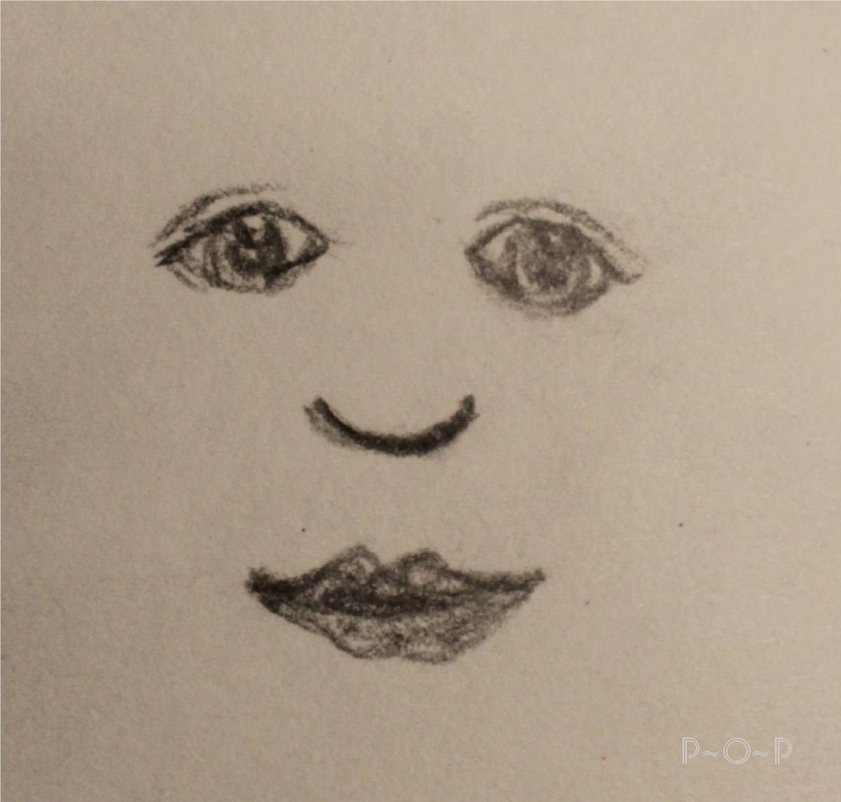
I am going to use this picture for my nose today.


The bottom of the nose is a small sideways "C".  I also lightly etched in some eyebrows.


 Next, look at the nostrils of your model. For the most part, they are usually much smaller than we think,
depending upon the angle the model is being drawn.

The nostrils I drew here reminded me of little sunflower seeds,
(outside of the shells) with a little turned up eye lash on the edges.


The next really useful tip is to notice where the light is hitting the face.

Is there a lamp in the room that is shining on her face,
or the sun,
and where is it coming from?

That side of the face will be lighter, and the other side will have more shading/shadows.

I squint to help me see those shadows,
and it looks somewhat like this:


 Notice how when one squints, the details wash away and the light and dark places stand out more.
That's what we want.
I can see the light is hitting her face from my left side.


 Using that knowledge, I start shading the side of the face that is shaded
and I start around that nostril and up around the base of the nose slightly...


and then continue up that side of the nose,
constantly looking back at the model,
and squinting every now and then to make sure I am shading the area in the right places.

Always remember to draw what you see.


Once I have that reasonably done,
I start to lightly shade the other nostril.


 If I shade a place too darkly, I lightly erase.

This is a good time to erase the line in the middle as well.

I could leave my drawing loosely shaded,
or I can continue shading until I get what I want.


I chose to keep shading this sketch and finish the face.
(Feel free to stop whenever you feel you have worked on the facial features you want some practice on, or continue if you want even more practice.)


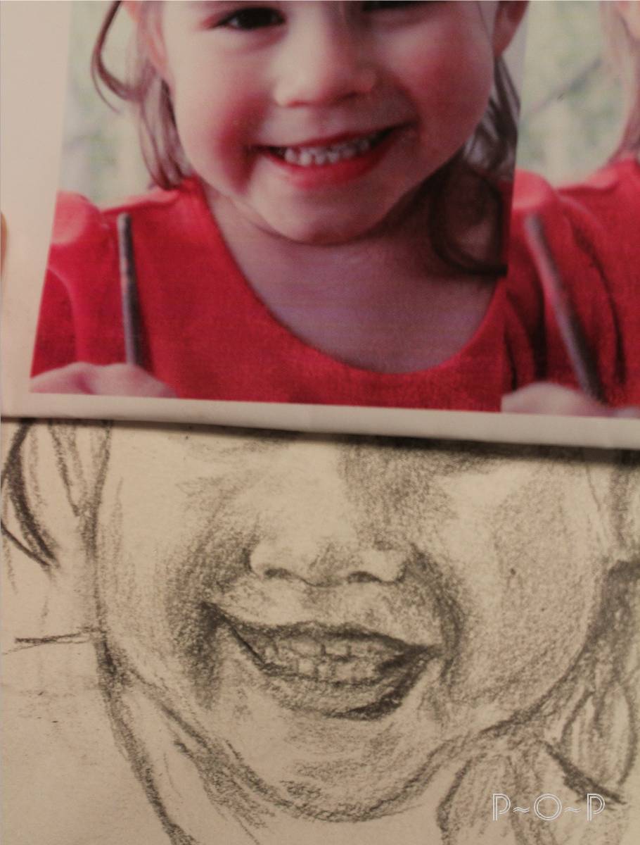
I continued with her mouth and facial features and hair.
This is just a sketch that I put in my sketch book, so I didn't worry about it being too perfect.


I am sure you will find, as I do, that drawing somebody you know is quite a bit harder than drawing a stranger or a character.  The details and personality you see most are often hard to catch.


 Here is the light sketch and then I continued and darkened it up some more.
(My drawing seems to be looking off over my shoulder rather than into my eyes, as the model's.
I will have to work better at getting the eyes as I see them next time I sketch,
but for now, I decided to end this one, since it is just in my sketch book;
don't be too hard on yourself in your sketch book.  It is supposed to be for fun and for practice).


Try sketching somebody's nose this week.  Try doing a simple nose first
and then shade as you feel more comfortable.

You will find as I do that the more you sketch, the more confident you will feel about trying it again next time.
And it is fun to see how your sketches improve as you do it more.

I am happy to be sketching again since I started these lessons,
and I hope they will help you and we can see ourselves improve each week.

Friday, March 22, 2013

Repurposing a Lamp with Paint.


The weekend is here, so I'll share another fun and useful craft.

If you have an old lamp you are not fond of, an easy way to alter it is to paint it.
I mix up some Plaster-of-Paris into a cup of base-coat color paint til I get the thickness/consistency I desire, and it seems to stick pretty well to any surface.
For this piece, I swirled the paint/plaster so it looked rough, like waves.

(I hope to make a "tools/recipe/helpful tips" page here soon,
and will give more precise instructions for the mixture then).

Once the base-coat is dried, I then paint the images or scene.


This lamp came from a charity type yard sale to help a little girl with a debilitating disease,
so it seemed an even more worthwhile decision to purchase the lamp for repurposing.


My Kindergartener son has had a thing for Jonah and the whale this past year,
so for Christmas, I painted the lamp for his bedroom.


I used a permanent ink and calligraphy pen to add the verse after the scene was painted and dried.


I practiced the writing on paper a few times first.
I liked this verse as it could be something that might help him someday.


That is supposed to be Jonah sinking in the sea,
with a shark off to the right for my son's benefit
since he loves all "dangerous" sea creatures at this point.


His other favorite, the squid, made it on the back side of the lamp.


It is a small thing, really, just a little paint on a lamp,
inexpensive and using something to "recycle" it,
but seeing how much he loves this sort of thing, made it worth it.


Have a fantastic weekend and if you get a chance,
pick up a paintbrush and capture something beautiful around you.


Wednesday, March 20, 2013

Vintage Cow Illustration


Some people collect depression glass 
(Oh, so pretty!)
Some people collect thimbles or spoons or tea cups.

When my husband gave me a gift certificate to the antique store for my birthday
with the added gift of baby-sitting the kids at home while I roamed the aisles,
my bliss took me to the bookshelves to rummage for what I have a passion for:
I collect old books with beautiful illustrations.
I am particular about the age, the look, and the price.
When one is found that is chock full of wonderful illustrations,
I am giddy with my prize.


I admire the way so many of the old books were so carefully illustrated
and try to mimic their technique in my own drawings.

Of course, many of the illustrations made before the late 1800's were actually created on blocks of wood
and then carved for their reproduction into book form,
sometimes by the artist, but usually by another artist specializing as a draughtsman or wood engraver.
(You can read and see some interesting information on this if you click >HERE<)

It is great to admire artists and try to duplicate their style of work
and then because you are an individual, your artwork will be different.

Here is a piece of illustration from a book called Play Days that was published in the late 1800's.


It is a small illustration, measuring 5" by 3 1/2", taking up about 1/3 of the page...

but the detail of the artwork is amazing to me!


 I take pictures of these illustrations with my camera because I find that they come out much clearer than when I tried to scan them through my printer.

 I cleaned the image up using my computer photo editor,


 and as I did so, I zoomed in on parts of the picture
to find how incredible the detailing is.


 My daughter said to me the other day that the picture she had to draw for her art class was too detailed.

After seeing how detailed this picture is
I cannot imagine how much time it took.


 Here is a picture of the dog zoomed in and cleaned up...


...and here he is zoomed in straight from the picture I took of the book.
He looks a bit like our Border Collie mix and as interested in the cows, too.


You are welcome to use any of these prints.
They are not copy-righted because of their age,
as far as I know.

 
 I enjoy using old illustrations on cards.

Scenes like this draw a person in...
reminding us of simpler times:

old moo-ly cows.


Linking to:


Monday, March 18, 2013

Painting Spotted Animal Fur


Hello, friends, and welcome to another lesson in art.


When you think of spots, what do you think?

Little circles or dots is the first thing most of us think of.
Like droplets, round and perfect.

But most animals that have colors or spots have variety in their colors...
and spots.

 Now here's a happy little fellow to demonstrate for us.

If you look at his fur from far away or at a quick glance, it's easy to think dots of black,
but if you look more closely, it would become more obvious that some are large, some small,
some are brownish and others black,
and pretty much all of them are not perfect little circles.

If you were to come up and rub his fur backward,
he wouldn't like it much, but you'd see that under his fur, his undercoat is actually mostly black,
but the white fur sits on top.


 I was working on this project for my living room,
so I thought I'd use this cow to demonstrate
(sometimes it is helpful to get a piece of art in plaster form
to practice something like fur and get to know the body structure of an animal).


I printed up a few images of real cows from the internet
and then used the colors I wanted for my own.


 I base-coated him in a bright shade of brown.


When paintbrushes get old and uneven like this,
I tend to throw them away, except this one still had plenty of soft bristles.
I knew this type of condition would be great for painting a rough splotchy look,
like for tree leaves on a faraway tree...


or animal fur.


Here you can see how the old frizzy brush works nicely to make the fur look more realistic.


I worked in the white more heavily in some places
and dabbed it on lightly in others.


 I worked on some of his other details while I let the white on his fur dry.
I definitely wanted the white to dry so that the spots would be a crisp color
and not muddied at all by the white.  Patience in art is very crucial, but one can usually find other things to work on while waiting for something to dry.


Once dried, I began adding random splotches for spots.
I used a darker brown and also a lighter brown,
and had some that got mixed.

I kept adding spots until I hoped it might be enough.

Knowing when to stop is sometimes a hard thing to know.
So many times I wish I had stopped on a project instead of being too critical of my work
and then I get frustrated because I feel like I have done too much.


 Walking away across the room and looking at your project from a distance when you feel you may be done but are not sure is a useful tip.  Sometimes you'll notice something you need to fix;
if you don't see anything that looks as if it really needs work, then stop and let it be done.


Once you have created your own spotted animal either on paper or in a project like this,
it becomes fun to notice the wide variety in the animals you meet.
Try noticing animal fur this week, in books or magazines or if you go out.
Try sketching up a dog or other animal and giving him some "spots" in his fur
and see how creating spots of variety makes him look more realistic.

Friday, March 15, 2013

Painted Stained Glass


Do you have an old frame you aren't using?


Here is a simple fun project anybody can do:

You'll need some glass paints: I used Martha Stewarts Gloss Opaque Glass Paint
and her Liquid Fill paint.


After removing the picture,
I picked out an image I wanted to use from the Graphic Fairy


and printed it to the size I needed for this frame.*


After I taped it to the back of the glass,
I used some black opaque paint
and squirted it onto the glass along the lines of the flower I wanted to highlight
also creating some outward lines to give it a pieced glass look.
I let this dry well for about 2 days.


I used some of the paints straight and others I mixed the colors to give more variety.
I mixed liquid fill with them to thin them some.


 Here is the piece all painted in and set aside to dry.


When it dried, the painted edges cracked some.
I didn't mind on this piece as it was just an experimental piece.
For my next larger piece I used the paints specifically called "liquid fill" paints to prevent this from happening.
(I'll show you that piece as well...soon)


It makes for a nice bit of color in the bathroom window.


A fun use of an old frame and there is plenty of paint left for other projects.


*This is how I use transfer images for me to use:
1. Open up Microsoft Word on your computer.
2. Click on the image you want to transfer, and it should pop up in a new window.
3. Right click on the image, and click "Copy Image"
4. Click back onto the open Microsoft Word window.
5. Right click again, and click on "Paste".
6. The image should now appear on your Microsoft Word page.  It can be shrunk to whatever size you want by clicking on it, and then place your mouse in one of the corners, click, and drag the image to the size you want.
7.  Place the image on the page where you want it, and print it up.


Linking up to: