Showing posts with label wood. Show all posts

Thursday, May 22, 2014

Art Lesson: Watercolor Painted Vintage Wall Art


I was feeling the need to make my mantel sing of spring,
so I dug up these old wooden oval pieces I had once painted on and decided I did not like.
I decided to paint the edging of these ovals in black.


I found some vintage images on the Graphics Fairy of birds and printed them up in the center of each page by pasting them into Word and situating them to the size and place that I wanted them.


 (We've had a visiting blue jay to our yard in the last 2 weeks who is as blue of a blue jay I have ever seen).


I wanted to add a bit of color, so I splashed water all over the page with a paint brush
and then added some blue
and then some touches of red.


 Once that had settled into the paper a little bit,
I began painting the bird with a darker and less watered down blue.


 I filled in the leaves, branch, and flowers as well.


 Once the jay was done, I followed the same process for the Robin picture.


It is always a nice break to just paint an image that is already all drawn up for you.
Who doesn't love a bit of coloring-book style painting?


 I let these dry thoroughly and then cut them to fit into the oval shapes
(I did this by tracing the full oval shape onto the page and then cutting it down evenly on all sides until it fit, but a piece of tracing paper would also work to be more precise.
Laying it into the frame and running a pencil around the inside edge carefully should work).

Once I had them cut, I spread glue all over the backs of the images and then pasted them into the ovals, using paint containers to hold the image down on all the edges.


 Wanting a more vintage look, I heated some water and, using a damp teabag,
dabbed the warmed tea bag all over the image until it was stained as I wanted.
(This could also be done before gluing the image into the frame).


 The teabag was so used up, it cracked at bit and shed some bits of tea onto the images,
but I left them there to dry to add more character.


Once dried, I painted two coats of Mod Podge, allowing the first coat to dry completely before applying the second coat.
I then applied a squeeze of Martha Stewarts all purpose gloss paint from the bottle it comes in around the edges to make them look sealed in to the frame.  I used a paint brush to carefully brush it in and a few damp q-tips to clean up any smears.


Here they are all finished.  Can you see the difference with the Mod Podge?
The shine makes them look more like framed pictures.


I then put some frame wall hangers on the backs of the bird art
and hung them over the mantel in the living rooom


They added a touch of quaint, older looking decor to the wall with no expense at all:
I just recycled and used the supplies that I had...
aren't those the best kinds of projects?

Have you added any spring to your home this season?


I am still working on the bee picture.
It is coming along pretty well, but I am trying to wait until it is all finished before I share the processes I tried with it.

Thanks for stopping by!

Wednesday, July 10, 2013

Art Lesson: An Old Paintbrush, Brindle Fur, and a Boxer


Hello! Sorry I have been away so long.
I have had the unfortunate experience of my computer getting beyond repair and then having to decide what to purchase in its place.  I am very thankful for the help I received today in a friend who got everything fixed up and running well for me.
What a huge relief!


Now on to this week's lesson.


Painting animal hair can be quite a challenge.


I was recently asked to paint a life-sized wooden Boxer.
The difficulty was that it was brindle colored.
Brindle coloring gives an animal a striped look.
This particular boxer has a brownish undercoat with black highlights.

I decided to see what kind of help I could find on Youtube.
The first video explained how the artist painted each hair of the horse in his artwork.
While I enjoy realism, I knew that this was not an option with the designated amount of time I wanted to spend on such a large piece.

The next video had what I was looking for
except that the woman on it was actually marketing this particular paintbrush she was using to make painting fur more feasible.
I decided to make a similar one from her explanation.


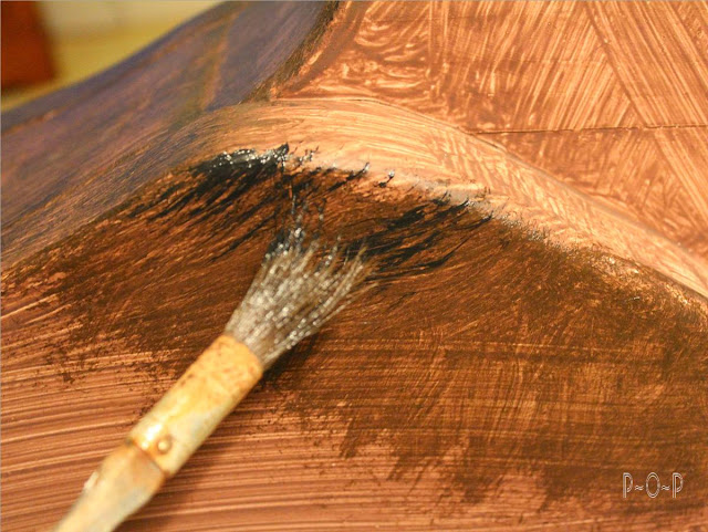
I took an old brush and cut triangular shaped sections from the paint brush, cutting up into the bristles.
This thinned the brush and made the bristles whispy and more flexible.


Using acrylic paint for this piece, I coated the whole dog with brown.
(It had a white base coat already on it).


Once the brown dried, I squeezed a generous portion of both brown and black into my painting bowl.


Touching the brown paint to the brush, I painted a small section onto the dog in the direction that the hair falls.


While this was still wet, I dabbed some black onto the bristles and worked that on top of the brown.


Once I got that worked in the way i wanted, I applied a bit heavier black paint in certain sections to give it the brindled look.


I kept some of the brown lighter in sections to give the brindle look a bit more distinction, working it until I got the look I hoped would be what the owner wanted for this piece.


I used photos to work on the face and specific features of this dog.
I hope I caught his personality in his eyes. 
 It was obvious by the pictures that he is a sweet dog.


Sometimes something as simple as cutting up an old paintbrush to become a better tool for you is a useful solution to a perplexing situation, such as the brindled coat of an animal.


Have you created any tools to help along an art piece?  I would love to hear about it.

Thanks so much for stopping by!


Wednesday, June 5, 2013

Art Lesson: Blue Skies, Blue Mountains, Blue Grass.


Have you looked up and noticed the blue sky lately?

Did you know that if we did not have the atmosphere that we do on earth, the sky would be black like it is on the moon?  How sad that would be.  Of course, we could not live without our atmosphere, but the blue sky does make it even nicer considering all the colors it could have been.

I love blue skies!


The way that light travels and hits the atmosphere of the earth causes the colors of light to separate in such a way that the blue rays that make light are what we see,
making the sky blue.


Notice how the blue seems darker higher up in the sky whereas on the horizon, it is lighter.


The atmosphere that we have also creates a bluish color in the distance.

I went out into the pasture to try to capture some pictures to demonstrate this.

I opened up and let more light into my camera lens for this shot to try to make it easier to see the bluish tint we see in far-away landscapes.


This is called atmospheric perspective.

 Also notice that often the grass that is nearest to us is brighter and more distinct.


 As we look further back into the distance, the shade of the grass color takes on a slightly darker color made by a slightly bluish tint (the droplets and light in the air, atmosphere, contribute to this).  This bluish shade can really be seen when we look at the shadow of the trees on that far hill.


Of course, the way the sun is shining and where it is hitting when we look also can decide how bright what we are looking at will be and where the shadows will fall.

Notice the picture below is the same picture as the one above but just up a slight distance:
the sun here is behind the treeline,
making the grass have a darker shade than the grass in the distance that is highlighted by the sun.


There is much to keep in mind when painting a picture, isn't there?

It is what makes the world so beautiful and full of liveliness:
the many colors, hues, and shades.


As I am still working on some coloring/teaching pages for the Ten Commandments, I thought I would use this lesson to color one of the pages with my Copic markers.


 I used a light yellow green to start.


 This was followed by more greens.
I find I use the most variety in the greens.


For the sand, I started with a skin white...


 followed by light suntan on the sand 
and dark suntan and sepia on the tree trunks.


 I started with the yellow to the tips of some of the tree's leaves,
 with more greens in the areas where the marker caps are placed,
and a warm gray for some shading,


 Some darker browns and a darker gray finished the tree trunk,
and some neutral gray on the sandy banks edging and rocks.
Pale moss was used again to double up some layers.


 A darker shade, Moss, was used for the first hill in the background.
a darker brown Caribe Cocoa on the sand banks,
and Pea Green for shading in/around the grasses.


 More greens for shading and variety.


 Finally, for the mountains in the background, I chose Ice Ocean, a light bluish green
and Blue Berry, a light bluish purple.


More shading and darkening of areas near the marker caps, using those colors.


 Shading on the mountains as well as a second layer of Ice Ocean to deepen it.


 The colors from the mountains were then randomly squiggled in the stream.


 I used a bright Tahitian Blue to squiggle in some cloud edges, Pale Porcelain Blue stretched out beside them,
and a touch of a light neutral gray in the clouds.
The blender pen helped wash away the hard lines.


The grass looked too flat to me,


so I added a final touch of some greens to stipple in some grass,


and then the blender pen helped blend everything the way I felt was needed.

I love the blender pen.


I am enjoying experimenting with my Copic markers,
but am always amazed at how many colors cannot even begin to compare to the beauty
of God's world.

I hope you can go out for a pleasant walk soon and notice the colors.  If you think of it, see if you can see the bluish tint in the distant view.


Thank you for stopping by!


(I am sorry that I never posted a craft this past weekend.  I had a root canal that got infected and was well-nigh worthless to anything but a hot water bottle and the couch until it was fixed.)


Linking up to these blog parties:
The36thavenue.com
Theshabbycreekcottage.com
 Bystephanielynn.com:Sunday-showcase-party
Makingtheworldcuter.com
Firefliesandjellybeans.com 
Nominimalisthere.blogspot.com
Betweennapsontheporch
Theprairiehomestead.com


Tuesday, May 21, 2013

Art Lesson: On the Fence.


Hello!
Today I would like to share some thoughts on drawing wood.
My art lessons each week are not based on a certain process of conquering art skills,
but usually just consists of what I am learning along the way.

I have a project I am working on that includes a wooden sign,
so I thought I would take you through the process I went through.


 My idea started as a rough sketch.


with a few changes along the way.


When I got what I wanted, I outlined the picture with a copic liner and erased the pencil lines.


(Feel free to print up this image and make your own colored fence painting!
As always, my images are free for use, just not for resale).


While trying to decide what to do with the sign, I headed outside for a better idea of what wood looks like.


 I got some ideas from the old painted (non-functioning) outhouse we use for storing some tools.

I love the look of white-washed wood,
but I also got a few pictures of the natural color on the old grape arbor.


So many colors and lines in the old weathered boards.


While snapping pictures, our cat Moon came racing by chasing a creature.
I had to call my son and daughters when I saw what it was, hiding in the grass by my feet.


 He disappeared into the undergrowth under the lilac bush and we hoped he'd realize our yard with the cats and dogs wandering around isn't a safe cafeteria for rabbits.


I decided that the weathered wood was what I was going to attempt for my sign.


I began with some very light grays.


The darker grays were added...


and then I marked in some spots of greenish yellow.


Some warmer grays helped blend the colors.
 This was probably a good place to stop, but I didn't think it was detailed enough for what I wanted.
(I have a problem knowing when to stop when it comes to coloring).


 I added some even darker grays...


 as well as some extremely light blue.


 The colorless blender helped mellow the colors.


 A final coat of warm gray covered everything up, making a slight mossy look to the wood,
or, at least, that is what I was trying to get.


To add just a bit more age to the wood, I lightly drew in a few more suggestions of rough, cracking wood.


A final touch of colorless blender to make a few places lighter and accentuate the darker.


Wood is such a versatile and beautiful subject in artwork
even though it is such a simple thing.


The project is not finished yet, but I am hoping it will work for what it is intended.


If you have a chance to take a walk this week, notice the wood you encounter on your trip.
It seems to be all around, doesn't it?
Pick up a pencil or some colored pencils and see what you discover.
Remember, if you ever want to share what you've worked on, I would love for you to share it on my facebook page.


Thank you for stopping by!