Showing posts with label mountains. Show all posts

Sunday, September 15, 2013

Ten Commandments # 4 Coloring Pages


Today I am posting the 4th of the Ten Commandments from the verses in Exodus 20.
These verses were long,
so I made several pages to break them up.
You are free to use these for your children or Sunday school classes or such,
but please don't use them for resale.

Thanks so much for visiting my blog today.
(To copy these coloring pages, click on the image, right click, and then click on "copy".

Open up Microsoft Word and right click on the screen, and then click "paste".

 The image should paste onto the page.

You can then click "print" to use them as coloring pages.

If you have difficulties or suggestions, please let me know.) 


Here is the colorized version:


Thank you for stopping by!


For the rest of the Ten Commandment Coloring Pages,
Click on this LINK.


 Sharing at these blog parties:
Funkyjunkinteriors.net
Shabbynest.blogspot.com
Sixsistersstuff.com


Wednesday, August 21, 2013

Art Lesson: How to Paint a Wall Mural


Hello.
I am back today to talk about murals.


Wall murals can seem daunting because of their size,
but really, depending on the detail you want and the size of the space you are painting,
if you break the mural down into bits, it's not such a hard thing.


Here is what I do when I am planning a mural.

First: deciding on the mural you want to paint.

I have a confession.
I am a magazine mutilator.
Yes, I know, it does seem harsh to tear up beautiful magazines.


I have collected an assortment of pictures of images that I like over the past 20 years.

I have different categories of images I keep: favorite artists,
painted landscapes, painted birds, snowmen, rooms I like, farm scenes, farm animals, flowers, still life, borders and designs, fruit, painting tips, folk art, Christmas ornaments, Christmas decorating, 
and several other categories,
one of them being mural ideas.

  Keeping images for years can definitely become a pack-rat issue, so I try to only keep images that shout out to me and make me swoon.


Some images I keep because I like the style in which the buildings were painted;
or I like the way the trees were painted.


Like the wall mural in the picture above, I loved the fern style and put some of them on my wall mural.


Sometimes, I like the way the land is painted, the landscape and the layers of fields.


Adding fields of trees doesn't have to be extensively detailed and time-consuming it they are in a big mural where precision and care is spent on the scenes that are supposed to be more dominant.


It is great to start an image notebook to keep ideas that sing to your heart
or that you think you may find a useful help to you.


Once you have the general idea of what you want for your mural,
pick a basic wall color to work with.
At first on my mural, I painted the walls with a light blue,
but I did not like the way this looked for this space,
so I went with a banana cream color.
This color worked for the look I wanted, even as the "sky."


I remember when I decided to paint my wall mural,
I had a subscription to a painting magazine (I think it was PaintWorks) and there was a tutorial on how to paint a water mill.  I knew I wanted it on the wall.


It would be one of the main "art" portions, with more detailing spent on it.
I then had to decide where I wanted it.

When trying to visualize how you are going to paint your wall mural,
it is a good idea to grab something that washes off easily, like a charcoal pencil or some chalk board chalk (if your wall is white, sometimes the charcoal can slightly stain it, so I would suggest instead to use a piece of lightly colored chalk board chalk.)


Roughly sketch where you want to place your main objects on the wall.


When you know the type of landscaping or if you will add any other buildings or trees to your scene,
sketch them in.


If you don't like what you see, simply erase with a damp rag or paper towel.


Adding height to a mural, by placing a tree in the scene, makes the mural appear to have more dimension,

 as if the house is far away and the tree is closer.


Experimenting with this idea is great fun.


I remember when I was planning my mural, at first, I drew in taller trees,
and more of them.


I decided it was too busy, and cut them down in size and limited it to one tree at the top,
and one a little further down
and then a couple of trees that appear to be in the middle section of the landscape.


I put a fuller tree on the right side wall,
as well as some taller mountains.


This seemed to look better to me than making the trees exactly the same height on both sides,
giving it some diversity.


Working out your mural's background is completely up to your taste.

If you don't like the way a line is going,
simply wipe it off and try a new line.


The fun thing about murals is that they are a collection of pieces of artwork that you mend together.

Once I have my sketch the way I like, I can begin adding color to it.
I put washes of color, watered down colors that are light but not so wet that they drip.

Once the washes dry, you can be as detailed as you want.


or as simplistic.


To divide sections of land, which are just washes of different colors,
I would put a row of trees blocked in with very little detail.


This occasional tree or tree line helped me feel like there was more variety to the divisions of the fields.


If a person feels uncomfortable painting the detailed images of  mural,
 one could always use the transfer method to help.


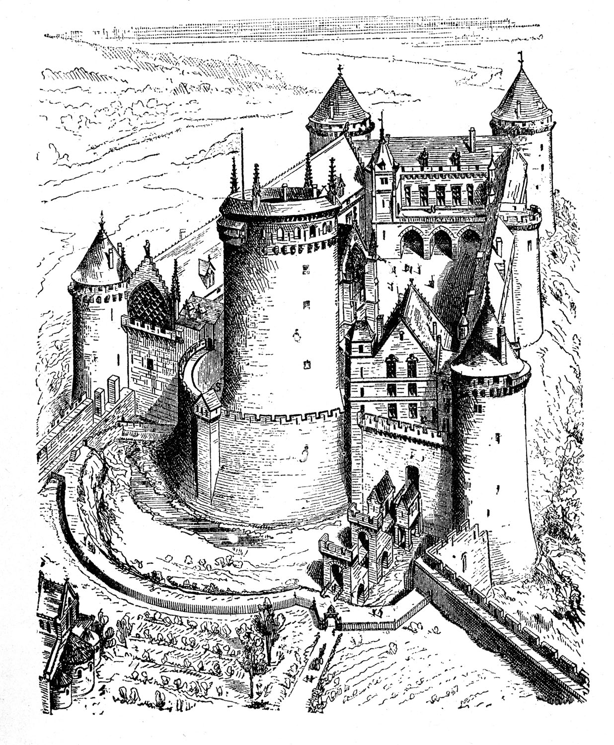
For example, if my daughter wanted a castle scene on her wall and I was not having success with a castle, I could always enlarge and print up this one that I love from the Graphics Fairy.


(I explain how to transfer and enlarge images onto Word Press if you click on <THIS POST>)


After coloring the chalk or charcoal pencil on the back and it is taped to the wall,

the parts of the image wanted on the wall are traced.


A desired landscape can be added.


A larger image can be used to give dimension.

My daughter would choose this one:


(Yes, I know he looks a bit out of shape.  Looks as if the Princess needs to work him more).


My son was watching me coloring on the wall with a bit of consternation,
but then he wanted a mural for him.


Anything is possible with a wall as a canvas.

And the great part of it is,
if you don't like what you have done, or if you someday want a change,
a coat of paint or two will wash it all away.


I hope this helps give you some ideas if you've been think about a wall mural.

Wednesday, June 5, 2013

Art Lesson: Blue Skies, Blue Mountains, Blue Grass.


Have you looked up and noticed the blue sky lately?

Did you know that if we did not have the atmosphere that we do on earth, the sky would be black like it is on the moon?  How sad that would be.  Of course, we could not live without our atmosphere, but the blue sky does make it even nicer considering all the colors it could have been.

I love blue skies!


The way that light travels and hits the atmosphere of the earth causes the colors of light to separate in such a way that the blue rays that make light are what we see,
making the sky blue.


Notice how the blue seems darker higher up in the sky whereas on the horizon, it is lighter.


The atmosphere that we have also creates a bluish color in the distance.

I went out into the pasture to try to capture some pictures to demonstrate this.

I opened up and let more light into my camera lens for this shot to try to make it easier to see the bluish tint we see in far-away landscapes.


This is called atmospheric perspective.

 Also notice that often the grass that is nearest to us is brighter and more distinct.


 As we look further back into the distance, the shade of the grass color takes on a slightly darker color made by a slightly bluish tint (the droplets and light in the air, atmosphere, contribute to this).  This bluish shade can really be seen when we look at the shadow of the trees on that far hill.


Of course, the way the sun is shining and where it is hitting when we look also can decide how bright what we are looking at will be and where the shadows will fall.

Notice the picture below is the same picture as the one above but just up a slight distance:
the sun here is behind the treeline,
making the grass have a darker shade than the grass in the distance that is highlighted by the sun.


There is much to keep in mind when painting a picture, isn't there?

It is what makes the world so beautiful and full of liveliness:
the many colors, hues, and shades.


As I am still working on some coloring/teaching pages for the Ten Commandments, I thought I would use this lesson to color one of the pages with my Copic markers.


 I used a light yellow green to start.


 This was followed by more greens.
I find I use the most variety in the greens.


For the sand, I started with a skin white...


 followed by light suntan on the sand 
and dark suntan and sepia on the tree trunks.


 I started with the yellow to the tips of some of the tree's leaves,
 with more greens in the areas where the marker caps are placed,
and a warm gray for some shading,


 Some darker browns and a darker gray finished the tree trunk,
and some neutral gray on the sandy banks edging and rocks.
Pale moss was used again to double up some layers.


 A darker shade, Moss, was used for the first hill in the background.
a darker brown Caribe Cocoa on the sand banks,
and Pea Green for shading in/around the grasses.


 More greens for shading and variety.


 Finally, for the mountains in the background, I chose Ice Ocean, a light bluish green
and Blue Berry, a light bluish purple.


More shading and darkening of areas near the marker caps, using those colors.


 Shading on the mountains as well as a second layer of Ice Ocean to deepen it.


 The colors from the mountains were then randomly squiggled in the stream.


 I used a bright Tahitian Blue to squiggle in some cloud edges, Pale Porcelain Blue stretched out beside them,
and a touch of a light neutral gray in the clouds.
The blender pen helped wash away the hard lines.


The grass looked too flat to me,


so I added a final touch of some greens to stipple in some grass,


and then the blender pen helped blend everything the way I felt was needed.

I love the blender pen.


I am enjoying experimenting with my Copic markers,
but am always amazed at how many colors cannot even begin to compare to the beauty
of God's world.

I hope you can go out for a pleasant walk soon and notice the colors.  If you think of it, see if you can see the bluish tint in the distant view.


Thank you for stopping by!


(I am sorry that I never posted a craft this past weekend.  I had a root canal that got infected and was well-nigh worthless to anything but a hot water bottle and the couch until it was fixed.)


Linking up to these blog parties:
The36thavenue.com
Theshabbycreekcottage.com
 Bystephanielynn.com:Sunday-showcase-party
Makingtheworldcuter.com
Firefliesandjellybeans.com 
Nominimalisthere.blogspot.com
Betweennapsontheporch
Theprairiehomestead.com