Sunday, August 18, 2013

Painted Mural on the Wall.

Today my home craft is about wall murals.

Here is the painted one along the stairway to our basement.

  My husband replaced all of the stairs
right away because they looked like they might have been from the original building date of 1850.

The cracks and sway of them made me fearful every time I went up or down them.

The walls were thick with so many layers of wallpaper, as I tried to remove them, the plaster of the wall looked like it might come off with them.
It was either a job of total renovation, or some other means of covering the bumpy, uneven walls would be needed.

Since my husband had to leave two months after we bought our farm with his military reserve unit to spend 9 months in Iraq,
and I am not good with either a sledge hammer or hanging new walls,
I thought I would patch the holes that were there
and paint a mural for his birthday present.


 I worked on it in hourly increments.
It gave me something to do for him and a great way to spend praying for him.


The ceiling at the base of the stairway was not completely closed in and had electrical conduit running at the seam, so I decided to paint a tree trunk here and add the artificial greenery to hide them.


 Painting the mural took time, but it was not as hard as I expected.

If it is broken down into sections, it is a fun and manageable art piece for the home.


 I will explain the steps of painting a mural as well as show some ideas.


To see the instructions for mural painting, click >HERE<.

Thank you for dropping in.

Friday, August 16, 2013

Free Vintage Image: Hummingbird in the Sky.


Welcome back, friend!


I was looking through
one of my old books, and I found this image.


I didn't think about it much and assumed they were looking at a plane
until I read the name of the story, "Little Hum," and read the sentence under the picture:
"They thought Hum was very small and pretty, and Hum thought they were giants."


Then I realized,
"They didn't have planes back then.  The skies were quiet and even the streets were pretty still."

Little hummingbird is what they looked out to see.


I cleaned up the image and made an antiqued version of it...


 and a black and white.


Here is the pretty border that was on the last page of the short story,

 
the antiqued version,

 and the black and white.

These are from a late 1800's book, so the illustrations are not copyrighted.

Feel free to make something fun from them.


I am sharing these images at these Blog Parties:


Wednesday, August 14, 2013

Art Lesson: Painting the Hand that Holds the Golden Duckling.


Hello, again!

This week, I decided it was time to finish my duckling picture
which I am painting on a recycled kitchen cabinet door
(I have had a couple of people give them to me when they came across used wooden ones that were unwanted).


I will be honest and admit that finishing this painting meant fixing that hand,
and painting hands is not something that I find to be easy.

I wish I had a bit more Jesse Wilcox Smith in me.


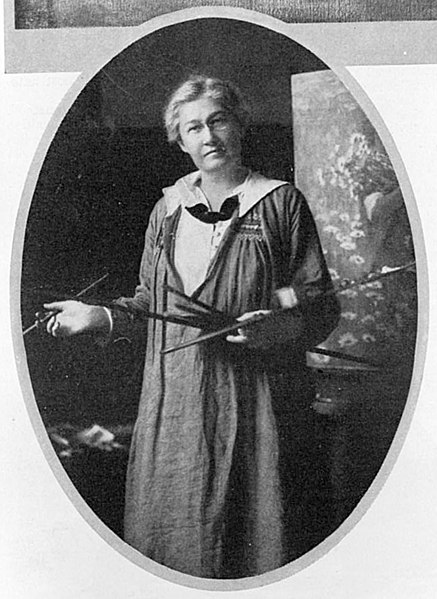
Jesse Wilcox Smith was an American illustrator born in Philadelphia in 1863.
Unlike many who pick up the pencil in childhood and sketch throughout youth, Jesse discovered in her early twenties that she enjoyed drawing and after studying under another great American illustrator, Howard Pyle, went on to illustrate for numerous magazines including over 200 covers for Good Housekeeping magazine.

Jesse was shy and lived with three (and then two when one left to be married), other young women artist.  They had a 50' by 50' studio built over the top of a barn and lived in the nearby carriage house.
Despite the fact that she never married or had children, she is well-known for her images of mothers with children and was recruited by many to illustrate their children.

She used a variety of techniques: charcoal, oils, watercolors, varnishes.
  

You will likely recognize her work:
This is the image from A Child's Garden of Verses by Robert Louis Stevenson.


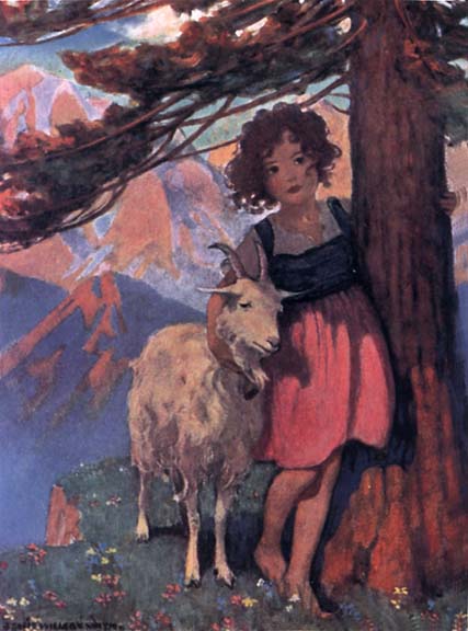
and this is the image she created for the book Heidi by Johanna Spyri.

(There are hundreds of other wonderful illustrations you can see by looking up Jesse Wilcox Smith.)


One thing Jesse is known for is her great ability to draw "hands."

I am not so skillful in the subject.

Skin is a colorful thing.

We may think of it as being generic in it's coloring,
but really, most skin colors have many colors in them.


I received this art catalog this week in the mail,
where I buy my copic markers and prismacolor pencils.
I noticed the painted woman's face on the front cover:
 look at all the colors in it.


 The catalog is in my hand right now, and it is actually more of a bluish tint, that greenish color around the nose, but there is green in there, too, yellow, pinks, browns, tans, whites, red, grays...
what color isn't in skin?


The way that light falls on skin can determine the colors in it.
Whether the hand is holding something can alter the coloring as well.

Notice the shading here?
The light is hitting the painted hand holding the duckling from the above left.
The light is hitting my hand directly straight down onto the side we see.

Can you see the difference in the coloring because of the shading?


To get warmed up with the paints, I decided to improve a few things in the duckling that I saw were wrong: the size of his eye, the coloring around his eye, and some of the softness in the shading of the feathers.


 Once I had finished up and felt more prepared to paint the hand, I looked at it and tried to decipher the colors in it
(minus the marker and paint stains on the actual picture of my daughter's hand).


When I looked at the hand, I decided to start at the lightest sections and work down from there.


I put a fresh layer of paint on
and then worked down into the reddish-orange shaded area...


 adding shading into the pointer finger as well.


I think part of the mark of being an artist is wearing some of the paint, don't you think?

My finger's always end up getting their fair share,
as using my finger to dab and mix in colors to blend seems to be a habit.


 Of course, constantly looking back and forth to the picture and identifying features that need more shading or distinctive colors made me fall into working on the two fingers from the other hand,
and I just kept working on areas that looked like they weren't quite right yet.


The painted fingernail got a bit of shading.

I used just a touch of blue along the lower edge of the hand and blended it well with the black.
It seemed to soften the dark edge with a bit of blue in it.


 I finished up by adding some crease lines along the lower finger and a few barely visible light lines of creasing where the wrist meets the arm.


 I set the picture down and walked away for a few minutes.

I find it always helps to set it down when I think I am done and come back with fresh eyes.
I can pick out areas that need touching up
like lightening the lower line of the hand in places to make it look more gentle
and fixing duckling tail feathers that weren't quite long enough.


At this point, I decide that I am done.
The hand is not perfect but I am happy with it as it is far better than other hands I have done,
and I feel like if I play with the paints any more, I may ruin the contentment I have for it right now.


 I finished a bit later with a slight background of the duck house wall.


It will brighten this wall in the bathroom until we take our things in to the fair in a couple of weeks.


What about you?  Have you ever painted a hand
or had fun noticing the hues of the skin?

Take a chance to notice this week and challenge your artful endeavors.

Thanks again for stopping by!

Sunday, August 11, 2013

Toilet Paper Rolls Recycled


Hello!

My sister came for a visit last week and asked about a craft I had made in a window
and I thought I would feature it here this weekend.


I got the idea looking through ideas on the web.

This one is fun:
 (She has a great wall of plates surrounding this wall art that she painted as well: you can see it if you click on the link under the picture).


I did this one earlier this year from an idea on the internet.


But these don't compare to the incredible artwork of the gnarled faces made from toilet paper rolls by
 created by Junior Fritz Jacquet
Junior Fritz Jacquet,


or the intricate cut outs of

I can't imagine the patience!


These simpler crafts are festive ideas for Christmas.


 The Christmas stars in the above picture were inspired by the ones here:
Designspiration.net


 Other great creations here: Camelotartcreations


Annaleeco.com


 This is the one I did,
just cut slices of the rolls,
glued them together in a random design using a glue gun,
and then painted them with acrylic paints with a bit of plaster of Paris mixed in to give it some extra stability.


 It is fun to see this window from the kitchen.


 There are so many great ideas for such simple things and some pretty amazing artists!


Thanks for stopping by and I hope you had a great weekend!


Linking up to:
Betweennapsontheporch
Theprairiehomestead
Frommyfrontporchtoyours.com
Theshabbycreekcottage.com

Thursday, August 8, 2013

Vintage Image: Ships in a Stormy Sea


The end of July through August, I have three nephews with birthdays.

As I rummaged through my cards looking for boy cards,
I found that I have a sad selection.

So this week, for my vintage image, I am posting something that can be used for the boys and men in our lives.


I found this great illustration in an old book from the late 1800's.

Here is a cleaned up black and white version.

 and here is an antiqued version.


 I also colored in one of the antiqued versions with my Copic markers.


and one final image I cleaned up and intensified on the computer.

After I spray painted an old pail I found at a yard sale, I used the colored version to add to it
to make a trash pail for my son's room.


 It sits beside the piece of furniture that I painted a little while back.
My husband ripped off the ugly laminate top of the base
and replaced it with old wood he found in the barn.
I also made new knobs for it from clay.


 I used Modge Podge to apply the printed image of the ships
and then on top of it.
(I have found if you apply Modge Podge in just a few strokes,
you can use it on printed paper without it running).


I love old images and the fun variety they can add to simple things.

Feel free to use this seascape for your own projects as it's age makes it
not under copyright.


Thanks for stopping by.


Linking up with:

Wednesday, August 7, 2013

Art Lesson: Developing Personal Style and the Creation of a Children's Book Part 1


Hello!

How has your week been going?

I took a trip to the library this week and browsed the children's books while my kids looked through their own choices.  (Having kids is a good excuse to get to be a kid again sometimes.
Of course, it's just probably good for all of us once in a while.)

There are so many different styles and art mediums used in children's books.


I have been working on some illustration ideas for my children's book.

Let me just clarify right now that I have never had a children's book published.
It is a dream of mine and I thought how it might be fun to share my efforts here on this blog,
realizing that rejection is a big part of it, but also that successes don't come unless the effort is made toward it. 

I took a class on writing children's books a few years back and hope to utilize it finally,
God willing.

With that, you may find a mention of it and a lesson now and then from it
because I love the fact that blogging helps keep me going in this crazy dream.

And I am glad you are here to come along with me as I wander down this unknown road.


 Up until now, I had some ideas floating around in my brain,
but nothing ever solidified into a story,
until a few weeks ago when this story came,
and I sat down and wrote it down.
I read it to my children and they loved it,
so I decided to start with this idea, 
being that my oldest is usually pretty blunt with giving me the truth
and she seemed to like it the most.

Now I would like to work up some pictures for illustration ideas.
I do realize that publishers often want to tie in a different illustrator for books they are interested in,
but I am hoping and praying my work might have a chance of facing the world together.

Anyhow, on to the lesson.


The main character of my book is our cat Moon.

I need to come up with some possibilities of drawing our cat in a kids' book friendly way.
I realized looking at those books that kids' book art is different than regular art,
friendlier, more colorful.
For now, I decided to sketch Moon out and get to know what he's like in shape and texture.

Sometimes, when I struggle with something,
I find that more detail is needed on the tracing paper sketch until I can get it to where I want it to be.


Because I wanted the original image to be transferred lightly onto my good paper,
I just used the pencil I was drawing with to rub onto the back of the image,

flipped it, and traced it so that it would very lightly transfer.


I used my fine tipped copic black liner to start outlining the image...


 and continued.


 Once I got the basics down, I decided to attempt this first sketch with my copic markers.


I used a light yellow in the eyes, might have been buttercup yellow.

 I used cool gray 7 to highlight some of the lighter areas of the black fur
and for his nose,
and then added the black for the darkest fur.

When working with black or dark colors, I always start with the lighter color and carefully work to the dark.  Lights can always be darkened, but darks are a bit harder to bring back to light. The colorless blender is great at picking up some of the dark color, but it has it's limits.


Skin white was used first on the lightest parts of the basket.


 I then used a lighter gray, I believe it was Neutral Gray 2,
on areas of the white fur.
 Rose Red was used in the ear with one of the lighter grays for shading.

For the shading and darker sections of the basket, I'm fairly certain that I used a color called 
Light Suntan.

I could barely keep my eyes open any longer, so I ended at this point.


This image was a good practice but I don't think I like it for a possible book illustration.
It is not the look I am happy with,
but I think it is a start.

I know that my sketch book needs to come out as well as my camera for more poses from Moon,
but I also know that every bit of practice is helpful in making progress.


I worked up another image on paper from my tracing paper sketch that I may try with either paints or colored pencils.

Perhaps I will try colored pencils along with copic markers.
We'll see.


 Finding one's own sense of style can be quite a challenge.

Thanks for coming along with me on the start of this fun journey.

I hope you can continue to develop your style and chase your art dreams as well.


*Yesterday I typed in "Children's book illustrations" on google and found quite a wide variety of illustrations and came up with quite a fun selection of images.  I followed one to an illustrator who uses computer to do much of his artwork, but his technique of sketching to get to know his subject matters was very helpful to me.

If you are interested, you can read it here.
(I do not know much about this illustrator, but am just sharing this post because I thought it helpful and think his artwork is incredible.)


Linking up to these fun blog parties:
Nominimalisthere.blogspot.com