Showing posts with label proportions. Show all posts

Saturday, April 4, 2015

Sketching Several Photos into One Piece of Art: the Farmer and the Horse.


  My house has been busy with several projects lately, and I thought I'd stop by to share one of them today.

   I was asked to do a piece for a lady that would be done in pencil.  Her husband has told their children stories about a farmer and his work horse and she wanted for me to create an image to remind them of those story times with him.  She wanted the man to be indistinguishable, as we all know how we form pictures in our heads when we hear stories, and she wanted each child to be able to keep their own ideas of what he looks like.

We looked up some images on Pinterest to try to get a working idea together, and I began to use these as basics of what to work toward.  (I will suggest if you like horses, type in 'work horse' or 'draft horse' on Pinterest...there are AMAZING pictures of them!)  I found several photos ideas for the farmer and the horse.

  I started by measuring out and drawing a box in the size that was wanted for the image to be.  This gave me guidelines of how large to make the sketches.


I spent a considerable amount of time sketching the images onto tracing paper.
(There were more eraser crumbs on that page than is probably legitimate for one piece of artwork!)
Often, I would stop and take a picture and then walk away, come back, and look at the picture in the camera.  Something about doing that makes me get a clearer perspective on it.
I could see in the image above that my horse's nose was off from what a work horse's nose should be.


In this sketch, I could see the horse's eye not right, and the man was a bit disproportionate as well.


I finally got a sketch I thought I could work with,
rubbed charchoal on the back lightly,
and then traced over the front drawing lines so the image would go onto my good paper.


I then began first with the eye of the horse.

When that was where and how I wanted it, I added some detail around it.


I did not mind that my horse was not exact. I wanted to take some artistic license as to the coloring and the angle that the horse would be approaching the farmer because I was using a few different photos to create the image I was trying to achieve.  The photos were just used as guides.


Here is a picture that shows you the light sketch that was transferred of the whole image.


I continued adding more details to the horse.


At this point, I realized I did not like what I was seeing in the nostril/chin/lower muzzle shape of the piece, so I set it aside to pick up for another day.

I will do the same now and will show the pictures/progress of that part in my next post.


Thank you for stopping by!


Thursday, November 14, 2013

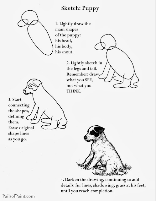
Art Lesson: Sketch Page of Puppy.


This week, I am sharing a page from my sketch book
showing how to draw this sitting puppy.


Here is the page from my sketch book.


Here is a page you may print up for your children or yourself,
if you would like to try sketching the pup.
(It is free for use, just not for resale).


Thanks for stopping by!


(To copy these pages, click on the image, right click, and then click on "copy".

Open up Microsoft Word and right click on the screen, and then click "paste".
 The image should paste onto the page.

You can then click "print".
If you have difficulties or suggestions, please let me know.)


Wednesday, August 14, 2013

Art Lesson: Painting the Hand that Holds the Golden Duckling.


Hello, again!

This week, I decided it was time to finish my duckling picture
which I am painting on a recycled kitchen cabinet door
(I have had a couple of people give them to me when they came across used wooden ones that were unwanted).


I will be honest and admit that finishing this painting meant fixing that hand,
and painting hands is not something that I find to be easy.

I wish I had a bit more Jesse Wilcox Smith in me.


Jesse Wilcox Smith was an American illustrator born in Philadelphia in 1863.
Unlike many who pick up the pencil in childhood and sketch throughout youth, Jesse discovered in her early twenties that she enjoyed drawing and after studying under another great American illustrator, Howard Pyle, went on to illustrate for numerous magazines including over 200 covers for Good Housekeeping magazine.

Jesse was shy and lived with three (and then two when one left to be married), other young women artist.  They had a 50' by 50' studio built over the top of a barn and lived in the nearby carriage house.
Despite the fact that she never married or had children, she is well-known for her images of mothers with children and was recruited by many to illustrate their children.

She used a variety of techniques: charcoal, oils, watercolors, varnishes.
  

You will likely recognize her work:
This is the image from A Child's Garden of Verses by Robert Louis Stevenson.


and this is the image she created for the book Heidi by Johanna Spyri.

(There are hundreds of other wonderful illustrations you can see by looking up Jesse Wilcox Smith.)


One thing Jesse is known for is her great ability to draw "hands."

I am not so skillful in the subject.

Skin is a colorful thing.

We may think of it as being generic in it's coloring,
but really, most skin colors have many colors in them.


I received this art catalog this week in the mail,
where I buy my copic markers and prismacolor pencils.
I noticed the painted woman's face on the front cover:
 look at all the colors in it.


 The catalog is in my hand right now, and it is actually more of a bluish tint, that greenish color around the nose, but there is green in there, too, yellow, pinks, browns, tans, whites, red, grays...
what color isn't in skin?


The way that light falls on skin can determine the colors in it.
Whether the hand is holding something can alter the coloring as well.

Notice the shading here?
The light is hitting the painted hand holding the duckling from the above left.
The light is hitting my hand directly straight down onto the side we see.

Can you see the difference in the coloring because of the shading?


To get warmed up with the paints, I decided to improve a few things in the duckling that I saw were wrong: the size of his eye, the coloring around his eye, and some of the softness in the shading of the feathers.


 Once I had finished up and felt more prepared to paint the hand, I looked at it and tried to decipher the colors in it
(minus the marker and paint stains on the actual picture of my daughter's hand).


When I looked at the hand, I decided to start at the lightest sections and work down from there.


I put a fresh layer of paint on
and then worked down into the reddish-orange shaded area...


 adding shading into the pointer finger as well.


I think part of the mark of being an artist is wearing some of the paint, don't you think?

My finger's always end up getting their fair share,
as using my finger to dab and mix in colors to blend seems to be a habit.


 Of course, constantly looking back and forth to the picture and identifying features that need more shading or distinctive colors made me fall into working on the two fingers from the other hand,
and I just kept working on areas that looked like they weren't quite right yet.


The painted fingernail got a bit of shading.

I used just a touch of blue along the lower edge of the hand and blended it well with the black.
It seemed to soften the dark edge with a bit of blue in it.


 I finished up by adding some crease lines along the lower finger and a few barely visible light lines of creasing where the wrist meets the arm.


 I set the picture down and walked away for a few minutes.

I find it always helps to set it down when I think I am done and come back with fresh eyes.
I can pick out areas that need touching up
like lightening the lower line of the hand in places to make it look more gentle
and fixing duckling tail feathers that weren't quite long enough.


At this point, I decide that I am done.
The hand is not perfect but I am happy with it as it is far better than other hands I have done,
and I feel like if I play with the paints any more, I may ruin the contentment I have for it right now.


 I finished a bit later with a slight background of the duck house wall.


It will brighten this wall in the bathroom until we take our things in to the fair in a couple of weeks.


What about you?  Have you ever painted a hand
or had fun noticing the hues of the skin?

Take a chance to notice this week and challenge your artful endeavors.

Thanks again for stopping by!

Wednesday, June 26, 2013

Art Lesson: Paint Challenge - One brush, No Rinse Water


Today was a hot summer day, so I pulled out the paints and paint brushes as well as some white paper,
and asked the kids if they wanted to paint.


While sitting there helping my son, who tends to get a bit frustrated when he cannot get the image in his mind onto the paper (so I had him draw it first and then paint it, which really helped him achieve what he wanted),
I saw the left-over paint sitting on his plate and picked up the paintbrush.


 My daughter was still working on her masterpiece, so I thought I would try painting her with the colors on the plate and the paintbrush sitting idle.


I decided I would use the paints and not rinse the colors out at all, but use them to blend and work them in.
This is a challenge every artist should try at some point.  It gives you a better understanding of paints,
how they blend and how to achieve colors that you didn't think were possible by mixing and manipulating.


 It was just a rough sketch and I thought I'd share it even though it is far from perfect.

The process was a great learning tool.


Of course, when having to ask the model to "look at me" too many times,
her patience tends to wane.


My son was intrigued by my rough picture, so he decided he wanted to be next.


 I started with the basic face shape using mostly white with very small quantities of red, brown, and yellow.


I then filled in the whole face, noting where the light was hitting and making the features on that side of the face look a little more white.


Not being able to rinse the brush made color switches interesting;
but blending seemed to make them melt into the page.


Next I attempted to add just a touch of red for some pink cheeks.


My model was very patient as I spent a bit more time on his face than his sister who had a much shorter attention span.  Still, I am sparing you the many pictures of his uncontainable laughter at having me staring at him.


 I began to try to define his facial features a bit more.  Perfection is not an object at this point; just a suggestion of what I see.


At this point, my son kept peeking up over the table at how progress was coming,
and he demanded to know why I was making him bald, so I turned to adding some hair.


 As I finished defining his face, he began to grow a bit weary of sitting, so we finished it up and decided it was good enough for our bit of fun.


It is not perfect, but it was a fun way to experiment with one brush, a few left-over paints, and a challenge to blend without rinsing colors off in between.


 And I think my son is happy that I finally added some hair to his head.


Your challenge for this week is to pick up a paint brush, squirt a few of the primary colors onto a plate,
and paint an image using what you having without rinsing the brush.

(If you want to feel better about it, feel free to pencil in a basic picture first and then paint it.
Start with the light colors and work into the darker ones.)

I think you will find it fun and very helpful in your understanding of paints.


Thanks for stopping by!


Wednesday, June 19, 2013

Art Lesson: A Simple Trick for Re-using a Sketch.


Hello.

Today I am going to show you a trick my art teacher taught to us that I have found helpful on so many occasions.


Our ducklings began hatching out today, and I took some sweet pictures of the fluffy guys.


I decided I wanted to use one of the pictures I took to make a painted piece for our bathroom
since I have a couple of ducks in it as a slight decor theme.

I also possibly wanted to create some cards with the image.

A helpful way to work on an image before sketching it onto the final piece is to sketch it onto tracing paper.

This allows most of the sketching, erasing, proportioning to be worked on until the desired look is achieved.

There are tricks to getting these elements.


This is a sketch I did on tracing paper a while back.
I used a grid on my tracing paper and created the same grid on the picture that I had photocopied and enlarged.

I was able to check out my proportions based on what was in each square of the grid of the photo copy.


For my duckling picture, I decided to skip the grid and just sketch the image,
using my pencil to measure the the length of the hand and then the fingers.


I then used my pencil and measured up the length of the duckling's body and head,
compared to that of the hand and fingers.


From here, I began attempting to place the eye of the duckling, reworking the shape of the eye until I got what seemed right, as well as some of the shaded lines on the face and wing.


 Whenever I felt stuck or confused about what was wrong with my sketch,
without actually touching it, I ran my pencil over the image on the photo on the area I was trying to draw
to capture the shape/angles of the area I was trying to correctly see.


 (Here I was running my pencil over the area of the tail and up and over the thumb.)


I set this image aside for now until I have a chance to work on it again later this week,
giving my brain a rest from it so that when I come back, I will see it with new eyes.
I find this helps me better see what areas of the image may be incorrect.

However, I will not do too much more detail,
perhaps just a bit more of the line detail in the fingers,
and then I will have my sketched image on the tracing paper.

All of my erasing and measuring marks will be on it instead of my final canvas.

I will be able to rub some softer pencil on the back of the image and then transfer the image lightly onto the final canvas, and be able to use that image again if I'd like to.

I will show you the details of this more clearly in a future lesson


Let me know if you have any questions or if something was not explained clearly.


(I had hoped to do more with this drawing, but the subject of this drawing swallowed up much of my time. Looking at them, though, can you blame me?
Watching them with their momma is hard to resist.)


Until next time, thank you for stopping by!