Thursday, May 30, 2013

This Little Piggy: Free Vintage Image.


My husband mentioned to me that he would like to get some more pigs soon.
It's always fun having little pigs in the barn: they so enjoy eating all the kitchen scraps.

While looking through the images in my old books, these seemed fun ones for today.


It looks like the boy is upset about something and the pig has come to comfort him
(I hope the pig hasn't rooted up the boy's garden patch).

 I made a black and white image as well as a sepia and white one.


 I also cropped out an image of just the pig.


 This image was on the next page, so I thought I would include it as well.


It looks like the pig is getting a good dinner.


Feel free to use these images as you please.  
The book they I got them from is from the late 1800's.


Wednesday, May 29, 2013

Art Lesson: Painting Colored Images on Dark Backgrounds.


For today's lesson, I thought I would show you a painted project with some tips along the way.

I had a little wooden sign that I picked up.

I sanded it down a little bit and then measured it for the image I wanted to put on.


 I added the word "freedom" to the banner I found at the Graphics Fairy using Word.
Then I printed up the banner and colored charcoal pencil on the back of it.
 I cut the image just a bit smaller than the board size so that I could see to place it centered on the board and then taped it down.
I then traced over the image with a pen on the top side, causing the image to pass onto the board
(I did not need to trace over the lettering and fine detail at this time: just the outline of it).

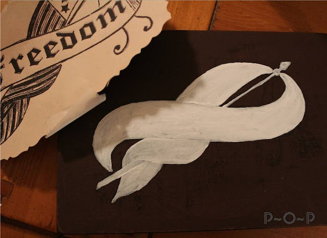
 After I took the paper off, I painted the whole image white.

The reason I did this was because, it being on a dark background,
if I just painted the colors that I am going to use directly onto it, they would not be as vibrant as I want.

I will show you what I mean.


 First though, let me show you that after the white paint dried (and I did two coats of it),
I cut the paper banner out exactly on the outside edge of it and then colored the charcoal pencil on the back of it again. I carefully taped it onto the dried painted white banner.


 I then traced the top side of the graphic so that the detail was now on the white painted banner.


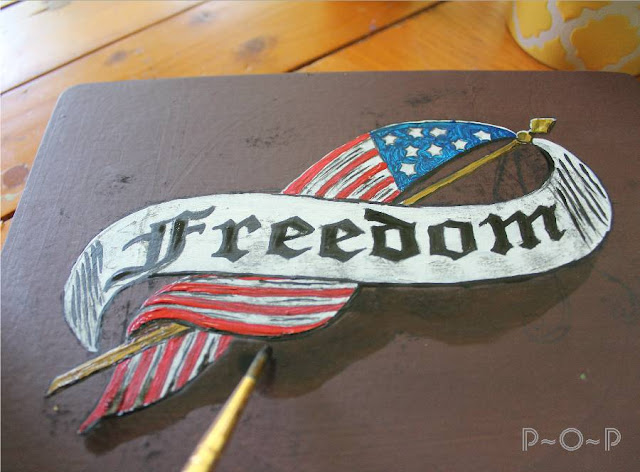
After carefully removing the taped banner, I began painting the colors using one of my favorite small paintbrushes.
(Do you find you tend to have a few favorites?)


 See how bright and crisp the colors show up on the white?


For the flag pole, I decided to mix some yellow with gold to give it a slightly shiny look.

(Please excuse my paint pallet: the bottom casing from my frog tape.  
I tend to use what is in my supplies and this does make a handy plate of paint.)


I used this gold/yellow also on the circles border I put around the edge, mixing in just a touch of black on those to give them some dimension.


I outlined a few parts of the banner with some black,
mostly on the lower parts of the graphic to look like shadowing and to help define it from the brown background.

I also added some water to some black and painted a smeared black background in around the banner. 


 While this dried, I added the gold strings handing from the flagpole and let them dry.


I wanted to make the blue in this image pop more because I love blue canning jars and thought this would look pretty displayed with some, so I added some water to my blue to make a blue background over the top of the dried black one.


 This is where the difference can be seen between the blue on the white background of the banner and the blue on the dark background.  The blue on the white is bold whereas on the dark background, it is muted.

I painted a coat of this watered down blue and then while it was still wet,
I painted a thin line of black around the outside edge of the blue background,
blending it with a slight circle motion slightly into the blue.


 I felt it still needed just a touch more of blue, so I dipped my paintbrush in it
and swiped a few more bold blue strokes across the background.


After the whole thing dried well, I wiped off any excess charcoal markings and slightly sanded the wood to give it an antiqued look,
finishing it with a brown stain wax.


It is just a small decoration, but it will work well for the 4th of July as well,
and being small, it is easy to store.


Have you painted anything lately? 
Paint is such a different medium to use after so much of the colored pencils and markers I have used lately,
but it is a fun change.

Thank you for stopping by!


Sharing this at these blogs:
Gnowfglins.com
Thegraphicsfairy.com


Monday, May 27, 2013

Happy Memorial Day


Memorial Day is a day to remember those who have died to ensure our free nation.

Thank you to those who served and died,
and thank you to those who have served and lived and continue to defend freedom.

God bless you.


"It is for us the living rather to be dedicated here to the unfinished work which they who fought here have thus far so nobly advanced. It is rather for us to be here dedicated to the great task remaining before us -- that from these honored dead we take increased devotion to that cause for which they gave the last full measure of devotion -- that we here highly resolve that these dead shall not have died in vain, that this nation under God shall have a new birth of freedom, and that government of the people, by the people, for the people shall not perish from the earth."

 -Abraham Lincoln from the Gettysburg Address


(Image from the Graphics Fairy; a lesson on the painting of it will be following in the next day or two).

Linking to these fun blog parties:


Sunday, May 26, 2013

Garden Walk.


My craft for this week relates to Memorial Day, so I will be posting it later on Monday.

For now, I thought I would share a few pictures of my gardens.


Spring is my favorite time of year, and even though I know this is an art blog,
I love the creativity and many colors and forms to be enjoyed in gardening.


After all, gardening is a from of creativity and crafting through God's supplies of dirt, sunshine, rain, and vegetation.


In my shade gardens, I have a fondness for hostas.


Ferns are fronds of gracefulness as well.


I just reworked this garden into my herb and strawberry garden.


My front garden has been a work in progress this spring.


 Another favorite: the cheerful mountain bluet.


I never tire of Irises of every variety...


as well as the bold vibrance of the climbing clematis vine.


I see some weeds in this garden that need to be pulled.

I hope you didn't mind this slight diversion from pencil and paper.


Friday, May 24, 2013

Vintage Image: Foot Bridge Over a Summer Stream.


Welcome back.

Today I chose to clean up an image I found in a late 1800's book
of an inviting footbridge over a quiet stream.


I cleaned it and made it in brown and white for an antiqued look,...

 and I created a black and white image of it as well.

I thought for fun I would show what can be done with these images.


I colored one of the antique images with my Copic markers.


 (The fine detail in these old images never ceases to amaze me!)


To make cards, I printed up four of the black and white images and colored them.


(Once colored, it is easy to see by the two different images I colored
that the browned ink image definitely has a more vintage look,
whereas the black and white image has a more modern look to it).


 I wanted to add some messages on my cards since one was for a graduation card
and the other is a thank you card for a friend.

I used my fine tipped calligraphy pen and scratched some verses onto paper
(well, it seemed like my pen was scratchy today;
every artist can blame it on the pen once in a while, right? :)
More likely, I was not calm enough to attempt calligraphy;
but these will work for today).


 I used two verses on cards, and made another 2 cards with just the image on them.


Feel free to use any of the images for your own use,
including both the colored images
if you should want to.

(I explain how to use Microsoft Word to copy and paste images in a previous post
  >CLICK TO READ IT<,
if you happened to miss it and would like the help.)

Thanks for stopping by.


Linking up to these fun blog parties:

Tuesday, May 21, 2013

Art Lesson: On the Fence.


Hello!
Today I would like to share some thoughts on drawing wood.
My art lessons each week are not based on a certain process of conquering art skills,
but usually just consists of what I am learning along the way.

I have a project I am working on that includes a wooden sign,
so I thought I would take you through the process I went through.


 My idea started as a rough sketch.


with a few changes along the way.


When I got what I wanted, I outlined the picture with a copic liner and erased the pencil lines.


(Feel free to print up this image and make your own colored fence painting!
As always, my images are free for use, just not for resale).


While trying to decide what to do with the sign, I headed outside for a better idea of what wood looks like.


 I got some ideas from the old painted (non-functioning) outhouse we use for storing some tools.

I love the look of white-washed wood,
but I also got a few pictures of the natural color on the old grape arbor.


So many colors and lines in the old weathered boards.


While snapping pictures, our cat Moon came racing by chasing a creature.
I had to call my son and daughters when I saw what it was, hiding in the grass by my feet.


 He disappeared into the undergrowth under the lilac bush and we hoped he'd realize our yard with the cats and dogs wandering around isn't a safe cafeteria for rabbits.


I decided that the weathered wood was what I was going to attempt for my sign.


I began with some very light grays.


The darker grays were added...


and then I marked in some spots of greenish yellow.


Some warmer grays helped blend the colors.
 This was probably a good place to stop, but I didn't think it was detailed enough for what I wanted.
(I have a problem knowing when to stop when it comes to coloring).


 I added some even darker grays...


 as well as some extremely light blue.


 The colorless blender helped mellow the colors.


 A final coat of warm gray covered everything up, making a slight mossy look to the wood,
or, at least, that is what I was trying to get.


To add just a bit more age to the wood, I lightly drew in a few more suggestions of rough, cracking wood.


A final touch of colorless blender to make a few places lighter and accentuate the darker.


Wood is such a versatile and beautiful subject in artwork
even though it is such a simple thing.


The project is not finished yet, but I am hoping it will work for what it is intended.


If you have a chance to take a walk this week, notice the wood you encounter on your trip.
It seems to be all around, doesn't it?
Pick up a pencil or some colored pencils and see what you discover.
Remember, if you ever want to share what you've worked on, I would love for you to share it on my facebook page.


Thank you for stopping by!